

The hardest part of going global isn't the language. It's knowing what to keep.
Why Most Brands Get Lost
Every day some brand decides to go international. They translate the website. Change the currency. Sometimes the font.
And nothing happens.
Not because the product is bad. Not because the market is closed. But because the brand still feels foreign. Visually, structurally, in the way it feels, it's speaking its own language in a room where nobody understands it.
Most studios at this point do one of two things.
The first: full adaptation. Strip everything local, build a "global" website. Clean, neutral, safe. And empty. The brand loses the one thing that made it interesting.
The second: just change the text. The design stays the same. The structure stays the same. The logic stays the same. And the new audience feels like they weren't really invited.
Both lose. Because both ignore the real question: what in this brand is already universal, and what only speaks one language.

Where We Start And Why Not With Your Industry
When a brand comes to us wanting to enter a new market, we don't start with their competitors.
We start with the culture.
First, the client's local market. Not just their direct competitors, but brands from completely different industries in the same region. Because cultural patterns are stronger than industry patterns.
How people perceive space, scale, hierarchy and that doesn't depend on whether you sell clothing or software. It depends on where they grew up and what they consider normal.
We look for patterns. What repeats. What works regardless of the product. That's the cultural code of a brand, often invisible to the client themselves, but very visible to their audience.
Then the international market. Same industries, but global brands. What they do. What patterns work there. And most importantly where these two worlds overlap.
That overlap is the bridge.

What Stays. What Goes.
Let's look at a specific example — the Gulf market.
When you go through dozens of websites from UAE and Saudi Arabia, the patterns are immediately clear. The hero is always full screen. Large text, video, or a strong visual. No halves, no modesty in scale. It's the first thing you see and it works like a statement.
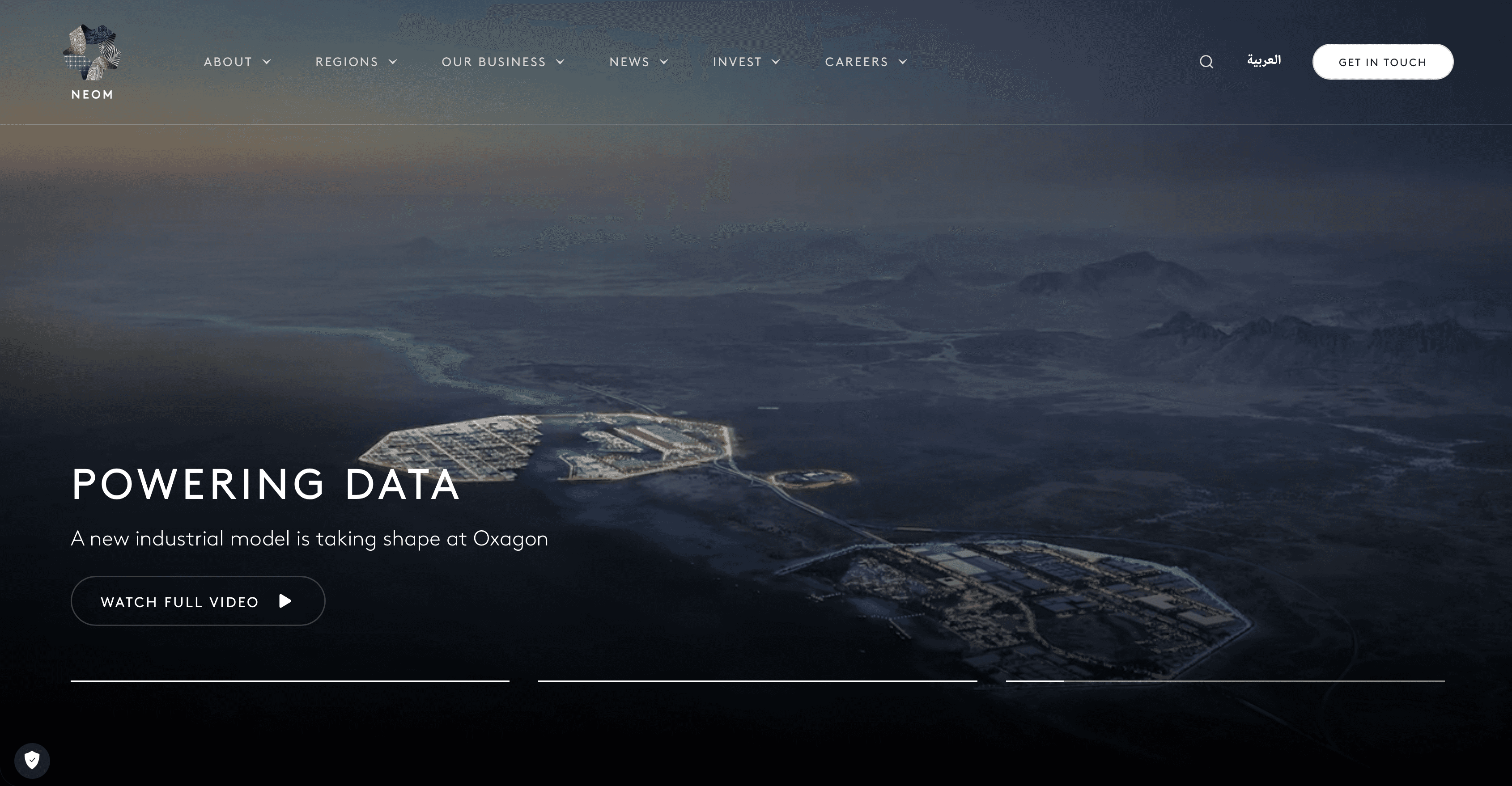
NEOM — a mega-project from Saudi Arabia. The first screen is a full-browser video. Almost no words. Maximum feeling. The brand communicates through scale before you've had a chance to read anything.
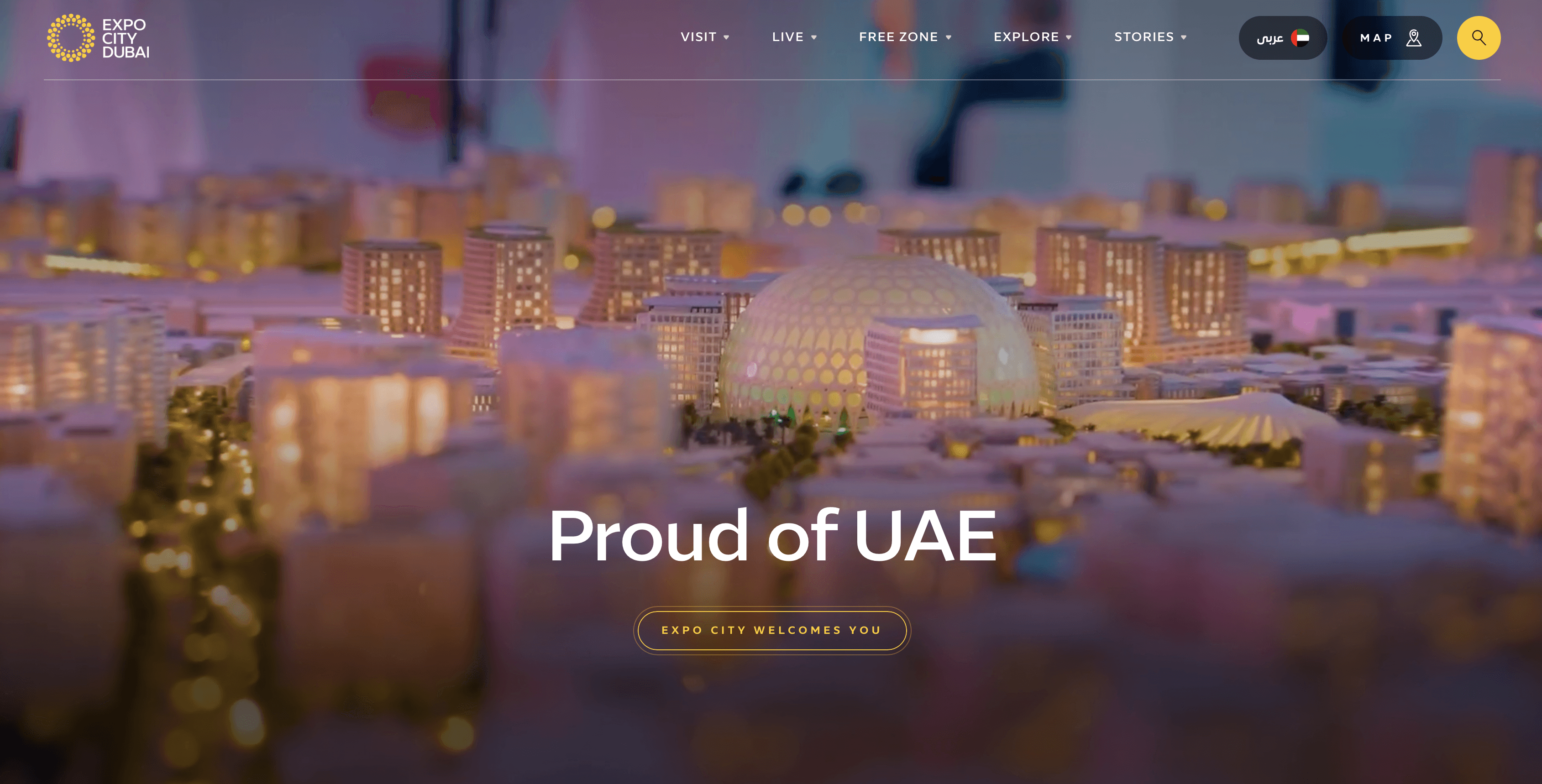
Expo City Dubai — an active urban district in Dubai, a cultural and business hub. The site uses warm light tones: off-white, soft shades, nothing cold or sterile. Large visuals, each section creates a sense of place rather than just delivering information. The architecture and atmosphere of the city come through in the design itself without explanation.
Jumeirah — one of the most recognizable luxury brands in the region. Video on entry, warm tones, an elegant typeface with real character. A feeling of richness without a single word about it. The site doesn't advertise the hotel, it makes you want to be there.

All of this — scale, illustration, impression is not a local quirk. It's strength. And it works everywhere. A European lands on a site like this and doesn't think "this is an Arab brand". They think "this is serious".
What doesn't travel — the RTL structure. Mirrored navigation, right-to-left reading logic. That changes technically. The density of Arabic text: it's naturally more compact, and English on the same screen will behave differently. That gets rebuilt too.
But here's the thing: when a brand is built around visuals and scale there isn't much text on screen. The hierarchy holds through image, not explanation. That kind of site travels easily. You shift the direction, adapt the typography for Latin and the core stays untouched.
Problems start when a brand is built on text and RTL logic as its foundation. Then when you translate, it's not just the language that falls apart, the whole structure does.
A Bridge Is Not a Compromise
One thing needs to be said clearly.
Adaptation doesn't mean becoming something else. It's not a compromise where each market gets half. It's when a brand becomes clear enough to be understood anywhere without losing its voice.
Every project we do for a new market starts with one question: what in this brand already works universally and how do we make that visible?
Not invent something new. Find what's already there. And remove everything that's blocking it.
That's the work.

Translation Is Not a Designer's Job
Translating text — that's a translator's job.
A designer's job is to find what in the brand already speaks without words.
Make that stronger. Remove what creates barriers. Build something where the new audience doesn't feel like a guest but like this was made for them all along.
A brand doesn't get lost when it moves to a new market if it was built right.
If it does get lost — the problem was there before. Before the new market.
A strong brand doesn't need a new identity.
It needs someone who knows how to show it properly.
