

Everyone wants to simplify. But simplicity is not the answer. Fit is.
There Was a Scientist
In 1956, British psychiatrist and cybernetician William Ross Ashby formulated a law that would later be called one of the most fundamental principles in systems theory.
It sounds simple: only variety can absorb variety.
Meaning: a system can handle its environment only to the degree that its internal complexity matches the complexity of that environment. Not more. Not less.
Too simple a system — it fails.
Too complex — it collapses from within.
Ashby was writing about cybernetics and control. But the law works anywhere a system meets an environment. In biology. In organizations. In products. In design.
"The law of requisite variety... is the most fundamental theorem in cybernetics." — W. Ross Ashby, An Introduction to Cybernetics, 1956

Design Comes in Different Forms and That's Not About Taste
When a founder says "make it clean and minimal" that's not an aesthetic request. That's a request for a level of complexity.
Sometimes it's the right request. Sometimes it's not.
B2C product: one user, one decision, one emotion. A relatively simple environment. Minimalism works here because it fits.
Enterprise product: six stakeholders, a three-month decision cycle, a technical product that needs to make sense to a lawyer, a CTO, and a CFO at the same time. A complex environment. And if you show up in that environment with three screens and a nice gradient — you don't look modern. You look unserious.
Not because the design is bad. Because the complexity level is wrong for that environment.
A minimalist landing page in enterprise is like walking into a Fortune 500 negotiation in a t-shirt. Maybe you're brilliant. But the context says something else.

Two Mistakes Almost Everyone Makes
Founders get this wrong in two directions. And both mistakes come from the same place: they didn't study the environment first.
First mistake: they simplify where they shouldn't.
They take a complex technical product like AI agents, infrastructure, a B2B platform and try to "make it simple." Strip out the details. Leave three bullet points. Make it look clean.
The client looks at it and doesn't understand how it works. Not because they're not smart. Because the communication system ended up simpler than their actual question.
The environment required explanation. The system refused to give one. No connection was made.
Second mistake: they overcomplicate where it's not needed.
Fifty features on a consumer app landing page. Technical documentation instead of onboarding. A dashboard with twelve metrics for a product with one use case.
The user came with a simple question. The system responded with an encyclopedia.
In both cases the system doesn't match the environment. In both cases the product loses the person.

What This Looks Like in Practice
There was a project. Enterprise client. The product — AI agents for business process automation.
Technically complex. Genuinely complex.
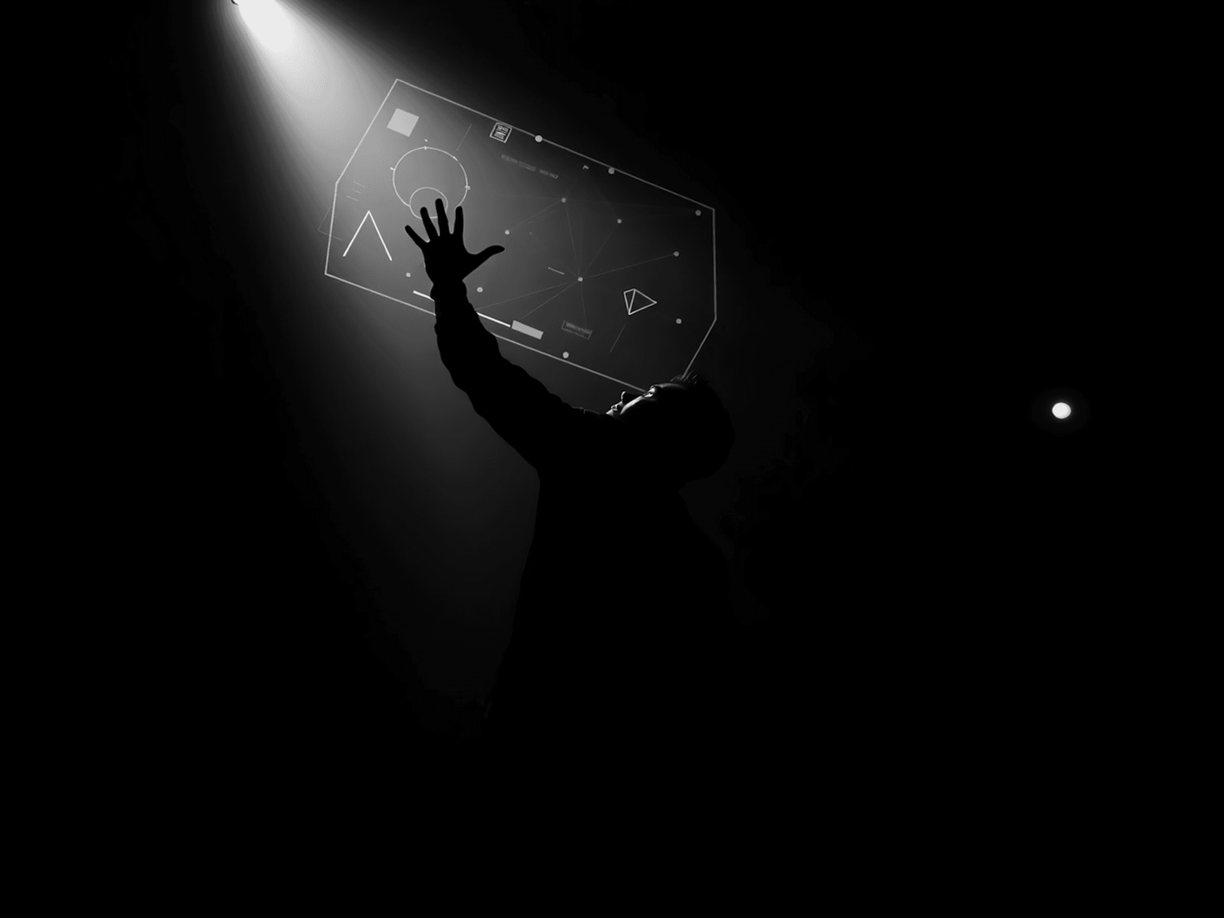
The first instinct was to explain through text. Write how it works. Lay out the architecture. But text couldn't carry it because what needed to be explained doesn't live in linear logic. AI agents are a network. Connections. Flows. You have to see it.
The second instinct was to simplify. Three steps, nice icons, "easy to understand". But that would have been a lie. The product isn't simple. And the client knows that.
The solution: organized complexity. Illustrations that show how the system works not hiding the depth, but giving structure to how it's perceived. Diagrams that think alongside the reader, not instead of them.
That's Ashby's law in design. The complexity of the environment doesn't get removed. It gets organized.
Environment First. System Second
Most founders start with the product. With the vision. With how they want the result to look.
That's understandable. But it's the wrong order.
The environment comes first. The environment is your actual user — their context, their questions, their level of expertise, how much time they have, who else is involved in the decision. The environment isn't an abstract audience in a brief. It's the specific complexity you're going to face.
Measure it first. Then build a system that matches it.
Not simpler. Not more complex. Exact.
Because design isn't about beauty or minimalism. Design is about fit. A system either answers the complexity of its environment or it doesn't.
And if it doesn't , so no gradient will save it.
