Evolvoom
Project
Project
Project
Project
Project
Project
AI sales agent for e-commerce that turns customer data into real conversations, not blast campaigns.
Year
2026
Industry
E-commerce / AI
Role
Landing Page
Timeline
2 weeks
OVERVIEW
Most AI sales tools look like AI sales tools. Cold, technical, full of dashboards and gradients that scream "automation." Evolvoom needed the opposite. The product talks to shoppers like a human, so the site had to feel human too. Warm, written, almost editorial — a landing page that earns trust through tone, not feature lists.
Most AI sales tools look like AI sales tools. Cold, technical, full of dashboards and gradients that scream "automation." Evolvoom needed the opposite. The product talks to shoppers like a human, so the site had to feel human too. Warm, written, almost editorial — a landing page that earns trust through tone, not feature lists.
Our goal was to make software feel like a person. The whole pitch is "this is not a chatbot, this is a conversation" — and the design had to prove that before a single word was read. If the page felt robotic, the product would be a lie.
Our goal was to make software feel like a person. The whole pitch is "this is not a chatbot, this is a conversation" — and the design had to prove that before a single word was read. If the page felt robotic, the product would be a lie.
THE CHALLENGE
Sell AI without looking like AI
Every competitor leans into the tech. Neon, dark mode, "powered by AI" stamped everywhere. Evolvoom sells the opposite promise — that the customer never feels the machine. So the challenge was to design against the category. Use a serif, not a grotesque. Use cream, not black. Show real chat threads, not feature grids. The page had to feel like a conversation with a sharp friend who happens to run a store. Restraint was the strategy.
Every competitor leans into the tech. Neon, dark mode, "powered by AI" stamped everywhere. Evolvoom sells the opposite promise — that the customer never feels the machine. So the challenge was to design against the category. Use a serif, not a grotesque. Use cream, not black. Show real chat threads, not feature grids. The page had to feel like a conversation with a sharp friend who happens to run a store. Restraint was the strategy.
DIRECTION
Three decisions
Serif, not system
The whole category uses grotesque type to look technical. Evolvoom uses a serif to look human. Headlines read like editorial, not software. The font alone tells you this AI talks differently.
01
Serif, not system
The whole category uses grotesque type to look technical. Evolvoom uses a serif to look human. Headlines read like editorial, not software. The font alone tells you this AI talks differently.
01
Warm, not cold
Cream and deep brown instead of black and neon. The palette of a café, not a dashboard. AI usually signals itself with cold color — here the warmth is the whole argument.
02
Warm, not cold
Cream and deep brown instead of black and neon. The palette of a café, not a dashboard. AI usually signals itself with cold color — here the warmth is the whole argument.
02
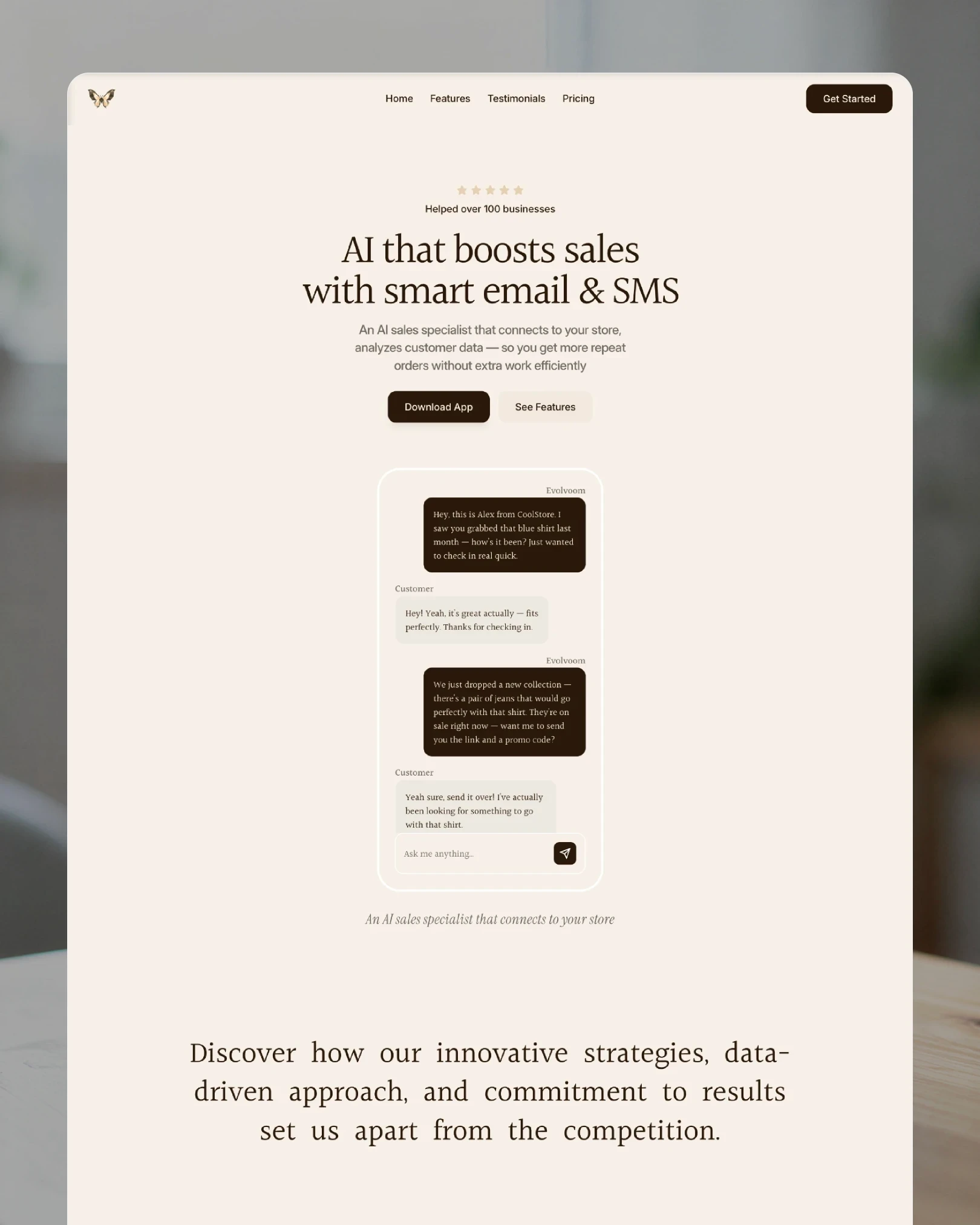
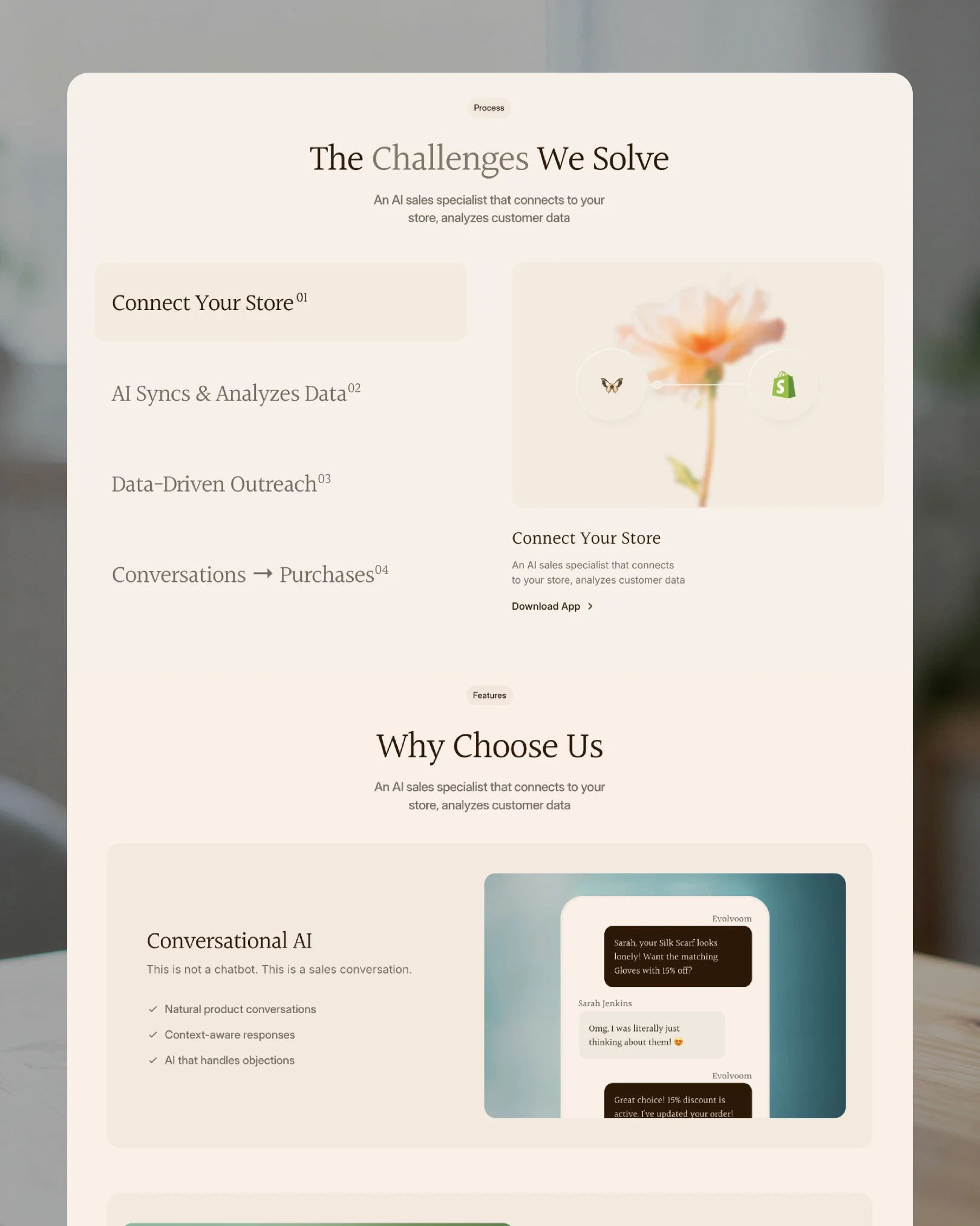
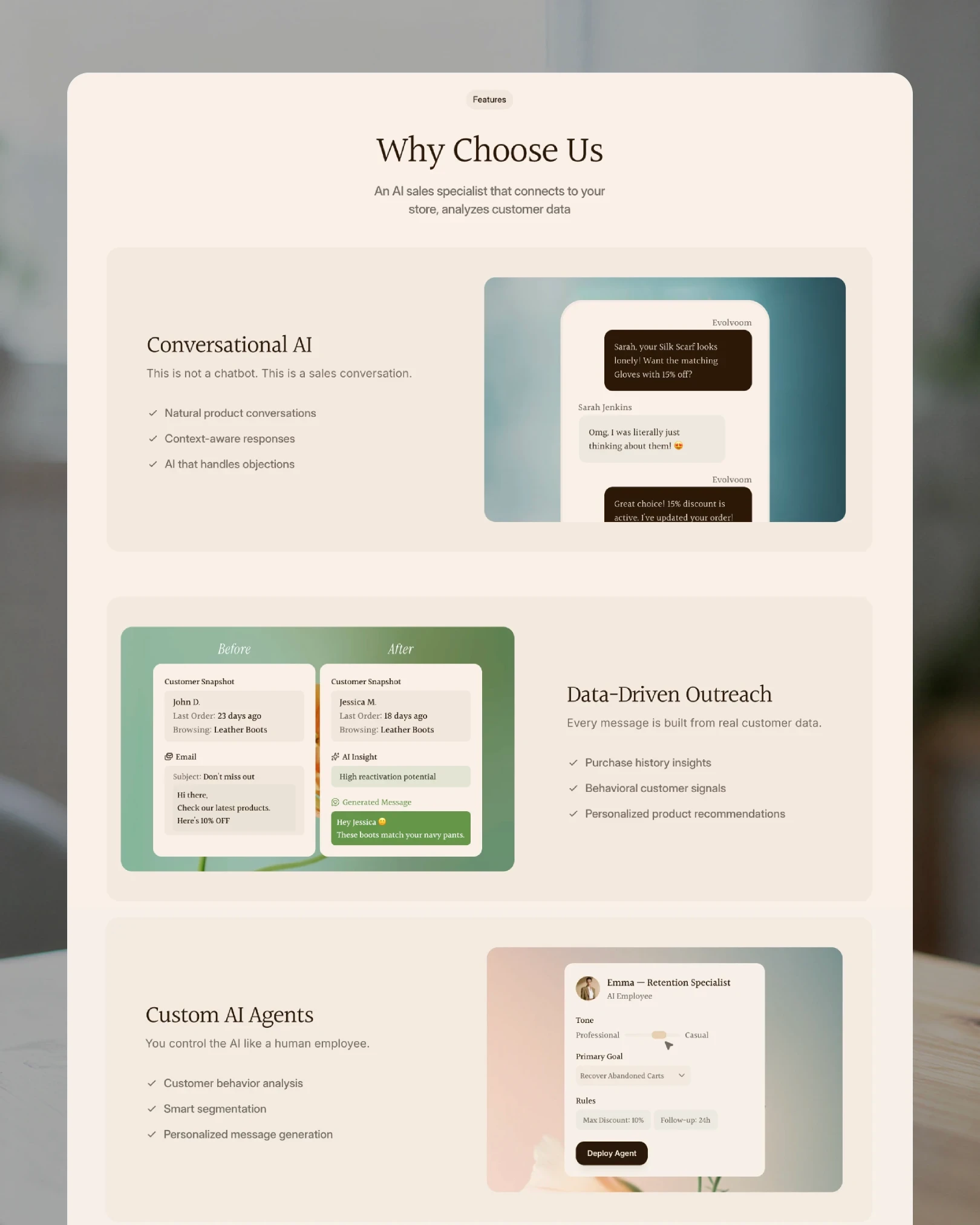
Show the conversation
No feature grids up front. Real chat threads carry the page — actual messages, real names, the AI selling in plain words. Proof by dialogue, not by bullet points.
03
Show the conversation
No feature grids up front. Real chat threads carry the page — actual messages, real names, the AI selling in plain words. Proof by dialogue, not by bullet points.
03
RESULT
Software that sounds like a person
Evolvoom launched as a landing page that argues by feeling. Warm where the category is cold, written where it is technical, conversational where it is robotic. The design carries the product's whole promise — that the customer never meets the machine. The site sells the way the product does.
Evolvoom launched as a landing page that argues by feeling. Warm where the category is cold, written where it is technical, conversational where it is robotic. The design carries the product's whole promise — that the customer never meets the machine. The site sells the way the product does.
Project
Project
Project
Project
Project
Project